Hello

Click here to add your own text Click here to add your own text Click here to add your own text Click here to add your own text Click here to add your own text
webers-web.info

Hello

Click here to add your own text Click here to add your own text Click here to add your own text Click here to add your own text Click here to add your own text Click here to add your own text Click here to add your own text Click here to add your own text Click here to add your own text Click here to add your own text Click here to add your own text Click here to add your own text Click here to add your own text Click here to add your own text Click here to add your own text

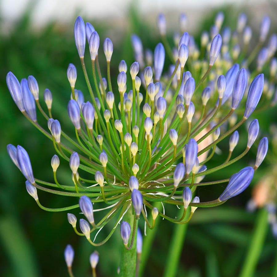
Alt Text for Flower

Hello

Click here to add your own text Click here to add your own text Click here to add your own text Click here to add your own text Click here to add your own text Click here to add your own text Click here to add your own text Click here to add your own text Click here to add your own text

guenterweber.com
@media only screen and (min-width: 768px) {
  .equalheight-flex .entry-content-wrapper {
    display: flex;
    flex-flow: row wrap;

    /*** items inside will be stretched ***/ 
    align-items: stretch;
    justify-content: space-between;
    position: relative;
  }

  /*** the columns is both flex-item and flex-container ***/
  .equalheight-flex .entry-content-wrapper .flex_column { 
    /*** settings as flex-item ***/ 
    flex: 0 1 31%;  /*** column-distance is ruled via this value ***/
    margin: 0;
    width: unset !important;

    /*** settings as flex-container ***/   
    display: flex;
    flex-flow: column nowrap;
  }

  /*** other elements do often interfere flex-containers ***/
  .equalheight-flex .entry-content-wrapper:before, 
  .equalheight-flex .entry-content-wrapper:after,
  .equalheight-flex .entry-content-wrapper .flex_column:before,
  .equalheight-flex .entry-content-wrapper .flex_column:after {
    display: none;
  }

  .equalheight-flex .entry-content-wrapper .flex_column > * {
    /*** all flex-items inside are not allowed to grow - but see next rule ***/ 
    flex: 0 1 auto
  }

  /*** that image container again is both flex-item and flex-container ***/
  .equalheight-flex .entry-content-wrapper .flex_column .home-image {
    /*** as flex-item the image-container is allowed to grow ***/ 
    flex: 1 1 auto;

    /*** as flex-container it aligns his items at bottom ***/ 
    display:  flex;
    align-items: flex-end
  }
}

Click the images to view in lightbox.

synchronize the breakpoint with the media-query