• Logo_with_Text-1

    Backside first

    Grid Sub-Title

  • Camera Camera

    Frontside first

    Grid Sub-Title

    Ich bin ein kleiner Blindtext. Und zwar schon so lange ich denken kann.
  • Paper-plane Paper-plane

    Backside first

    Grid Sub-Title

  • Paper-plane Paper-plane

    Frontside first

    Grid Sub-Title

    Ich bin ein kleiner Blindtext. Und zwar schon so lange ich denken kann.

Use grid layout modul – instead of flex

  • Best is to have squared images as source. On inserting them in the options set the Background Repeat  to contain
  • the element (Icon/Flipbox Grid) itself got that custom class: gridded-flipbox
  • you have to adapt the css of the grid-template-columns to your number of grid elements you like to have next to each other.
    e.g. grid-template-columns: repeat(3, 1fr);
#top .gridded-flipbox .avia-icongrid {
  display: grid;
  gap: 30px;
  grid-template-columns: repeat(4, 1fr);
  grid-auto-rows: 1fr;
}

#top .gridded-flipbox .av-icon-cell-item {
  aspect-ratio: 1;  /* === that is the trick === */
}

/* === no !important seems to be necessary here === */
#top .gridded-flipbox .avia-icongrid-wrapper,
#top .gridded-flipbox .article-icon-entry {
  width: 100%;
  height: 100%;
}


/* === if you like to have more responsive setting - f.e. 2 "columns"  === */
@media only screen and (min-width: 768px) and (max-width: 989px) {
  #top .gridded-flipbox .avia-icongrid {
    display: grid;
    gap: 30px;
    grid-template-columns: repeat(2, 1fr);
    grid-auto-rows: 1fr;
  }
}


/* === or if you do not want to have full-width items when there is only a 1 Column look  - use instead as media query === */
@media only screen and (max-width: 767px) {
  #top .gridded-flipbox .avia-icongrid {
    grid-template-columns: 70%;
    justify-content: center;
  }
}
  • Paper-plane Paper-plane

    Frontside first

    Grid Sub-Title

    Ich bin ein kleiner Blindtext. Und zwar schon so lange ich denken kann.

  • Paper-plane Paper-plane

    Frontside first

    Grid Sub-Title

    Ich bin ein kleiner Blindtext. Und zwar schon so lange ich denken kann.

  • Camera Camera

    Frontside first

    Grid Sub-Title

    Ich bin ein kleiner Blindtext. Und zwar schon so lange ich denken kann.

  • Logo_with_Text-1

    Backside first

    Grid Sub-Title

  • Paper-plane Paper-plane

    Backside first

    Grid Sub-Title

  • Paper-plane Paper-plane

    Backside first

    Grid Sub-Title

  • Camera Camera

    Frontside first

    Grid Sub-Title

    Ich bin ein kleiner Blindtext. Und zwar schon so lange ich denken kann.

  • Logo_with_Text-1

    Backside first

    Grid Sub-Title

  • Paper-plane Paper-plane

    Frontside first

    Grid Sub-Title

    Ich bin ein kleiner Blindtext. Und zwar schon so lange ich denken kann.

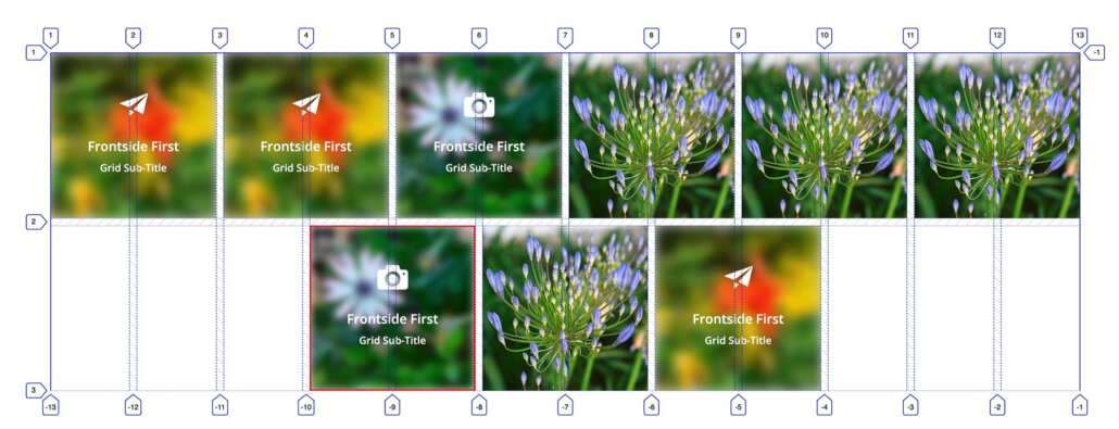
#top .gridded-auto-flipbox {
  container: gridspezial / inline-size;
}

#top .gridded-auto-flipbox .avia-icongrid {
  display: grid;
  gap: 10px;
  grid-template-columns: repeat(auto-fit, minmax(100px, 1fr));
  grid-auto-rows: 1fr;
}


.avia-icongrid-flipback,
.avia-icongrid-front {
  background-color: #cfcfcf
}

/* === all items use 2 column cells === */
/* === so we have a look as if we got f.e. 5 columns  - but we got 2 times grid-items === */

#top .gridded-auto-flipbox .avia-icongrid li {
  grid-column: span 2;
}

#top .gridded-auto-flipbox .av-icon-cell-item {
  aspect-ratio: 1; 
}

#top .gridded-auto-flipbox .avia-icongrid-wrapper,
#top .gridded-auto-flipbox .article-icon-entry {
  width: 100%;
  height: 100%;
}

/* === Now the container queries === */

@container gridspezial (width < 430px){
  #top .gridded-auto-flipbox .avia-icongrid li:last-child {
    border: 2px solid red;
    left: 0;
  }
}


@container gridspezial (width > 429px ) and (width < 651px){
  #top .gridded-auto-flipbox .avia-icongrid li:last-child {
    border: 2px solid red;
    grid-column: 2 / span 2;
  }
}

@container gridspezial (width > 869px ) and (width < 1090px) {
  #top .gridded-auto-flipbox .avia-icongrid li:last-child {
    border: 2px solid red;
    grid-column: 4 / span 2;
  }
}

@container gridspezial (width > 1090px ) and (width < 1310px) {
  #top .gridded-auto-flipbox .avia-icongrid li:nth-child(6) {
    border: 2px solid red;
    grid-column: 2 / span 2;
  }
}

@container gridspezial (width > 1309px ) {
  #top .gridded-auto-flipbox .avia-icongrid li:nth-child(7) {
    border: 2px solid red;
    grid-column: 4 / span 2;
  }
}